In our lesson we looked at different fonts, and why they are chosen on different films. There are basically two types of font:
Serif font - such as Times and Courier
and
Sans Serif fonts - such as Arial and Verdana
Serif fonts tend to be more traditional and often slightly more formal then Sans Serif fonts, which, are more modern and 'friendly'
FONT ANALYSIS
"Fonts convey an emotion without actually having to say the words."
- Neville Brody
PEARL HARBOR
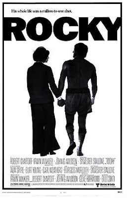
ROCKY
 Rocky on the other hand went for a more informal font, Franklin Gothic Heavy, as this suited the style of film much better then a Serif font. The title makes a really statement, big, bold and in capitals, reflecting the character of Rocky himself. The bold letters are squeezed together, and look as though their pushing out almost like a cleansed fist punching towards us, emphasising on the boxing theme of the film.
No comments:
Post a Comment